
Less than five years ago, the shrinking of Arctic ice, such as that near Iceland, pictured above, forced National Geographic cartographers to make a big, visible change in the newest edition of their atlas.
Maps are far more than sets of instructions on how to get from Point A to Point B. They tell stories. And whether they’re digital or paper maps, the tales they spin range from absurd to fun on one end of the spectrum and from informative to sobering and shocking on the other. In fact, before your next travel adventure, you may want to gather as many maps about the destination as you can before you depart. I guarantee they will tell you almost everything you want to know—without your ever having to crack open a guidebook or novel. (Although, I’d recommend both methods!)
For example, there are maps that will tell you if the place you’re going to visit uses the metric system (it probably does), the driving orientation (left side or right side), the population density, the popularity of various alcoholic drinks (beer, wine or other), the vegetation cover, the writing systems used and—one of my favorites—the annual coffee consumption per capita.
Then, there are maps that are entertaining and amusing, yet bittersweet. The Map of Where 29,000 Rubber Duckies Made Landfall After Falling off a Cargo Ship in the Middle of the Pacific Ocean is pretty cool—but also sadly informative about the dangers of junk in our oceans and how far it can spread. The map of the Number of Researchers Per Million Inhabitants Around the World is also compelling; it educates us about where decisions that affect conservation and the pressing problem of climate change are likely to be based on scientific facts.
To me, nothing could be more important.

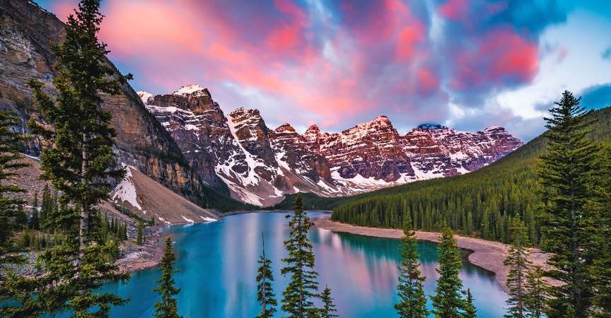
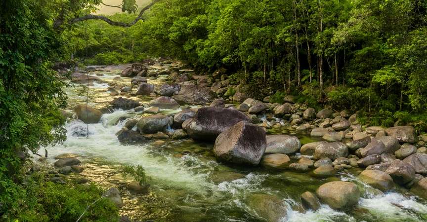
Topographic maps render the three-dimensional ups and downs of the terrain on a two-dimensional surface. They show works of nature including lakes, mountains, plains, rivers, valleys and vegetation.
The literal and figurative value of maps
There’s no doubt that maps are valuable—in more ways than one. In fact, they can be downright pricey, as the story of the world’s first modern atlas illustrates.
In the 15th century, German monk and mapmaker Nicolaus Germanus created an atlas based on very little reference material: Ptolemy’s Geographia, which depicted the known lands and seas of the second-century Roman Empire, plus reports from far-going travelers. It included a slightly crude Italian boot—at the time, Venice was a hub of East-West trade—an elaborately veined Nile and the Arabian Peninsula. In spite of omissions (Africa devolves into terra incognita and the Americas are nonexistent), it served as a model for mapmaking for the next few centuries. Woodcut prints of the atlas, 32 sheets, sold for $725,000 at Christie’s in 2016.
The first modern road maps that most of us are familiar with got their start toward the end of WWI. In November 1918, leaders of the American Automobile Association (AAA) in Detroit recognized the need for a national, first-class road system. They presented their views to President Woodrow Wilson in a 14-page bound letter, in which they argued that existing highway progress was “sporadic” and “haphazard” and that the lack of suitable roads was wasting invaluable time. They even presented the results of a test with a two-ton truck, showing how a 10-mile trip on a “modern concrete highway” used less fuel and took less time than on an “ordinary road.” Eventually, President Dwight D. Eisenhower signed the Federal-Aid Highway Act of 1956.

In 1992, approximately 29,000 rubber duckies fell off a cargo ship in the middle of the Pacific Ocean. This is where they made landfall. ©Map via prometheus08 on Reddit
But maps have gotten far more creative and educational over the years: a map of the time zones in Antarctica, for example, informs you that the Great White Continent is the only one without an official time zone. Each research station follows the time of its home country.
The creative capital of maps
One map story that happened less than five years ago is a particularly cautionary nature tale.
In June of 2014, cartographers who create the National Geographic Atlas of the World had to make one of the most striking changes in the publication’s history. The fifth edition of the atlas, published in 1989, was the first to comprehensively map the Arctic. But by the 10th edition in 2014, the shrinking of the Arctic ice sheet was so noticeable compared with previous editions that one National Geographic geographer called it the biggest visible change other than the breakup of the U.S.S.R.

This map of the time zones in Antarctica shows that many stations use the time of their home country or the one of their supply base. Many areas have no time zone at all, since there are no temporary settlements with clocks. ©Wikimedia Commons
Since the late 1970s, Arctic sea ice has retreated by 12 percent per decade, worsening after 2007, according to NASA. Ice loss is accelerated in the Arctic because of a phenomenon known as the feedback loop: thin ice is less reflective than thick ice, allowing more sunlight to be absorbed by the ocean, which in turn weakens the ice and warms the ocean even more. And because thinner ice is flatter, it allows melt ponds to accumulate on the surface, reducing the reflectiveness of the ice and absorbing even more heat.
While you may have heard warnings about rapid climate change and global warming for decades now, having the visual proof in your hands via a hard-copy map can make the message really hit home in a way that other means of communication have not.
Maps not only serve as instructions on how we can get from here to there. They tell us stories about the world; tales both humorous and sad. I think it would be worth following their directions, as well as their directives.
Here’s to finding your true places and natural habitats,
Candy


A nicely written article on the history and impacts of mapmaking.